
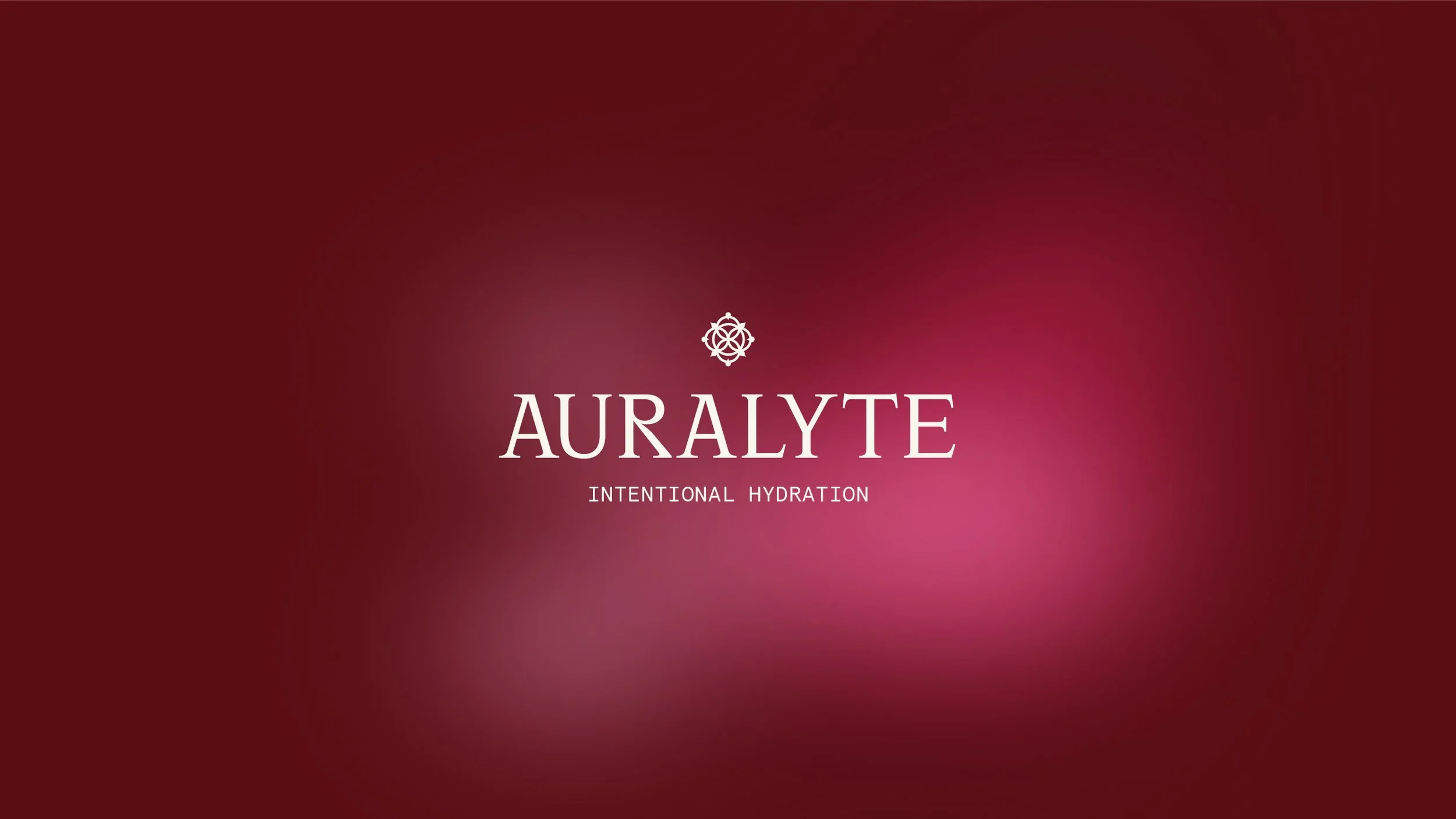
AURALYTE
2024 / Creative Direction
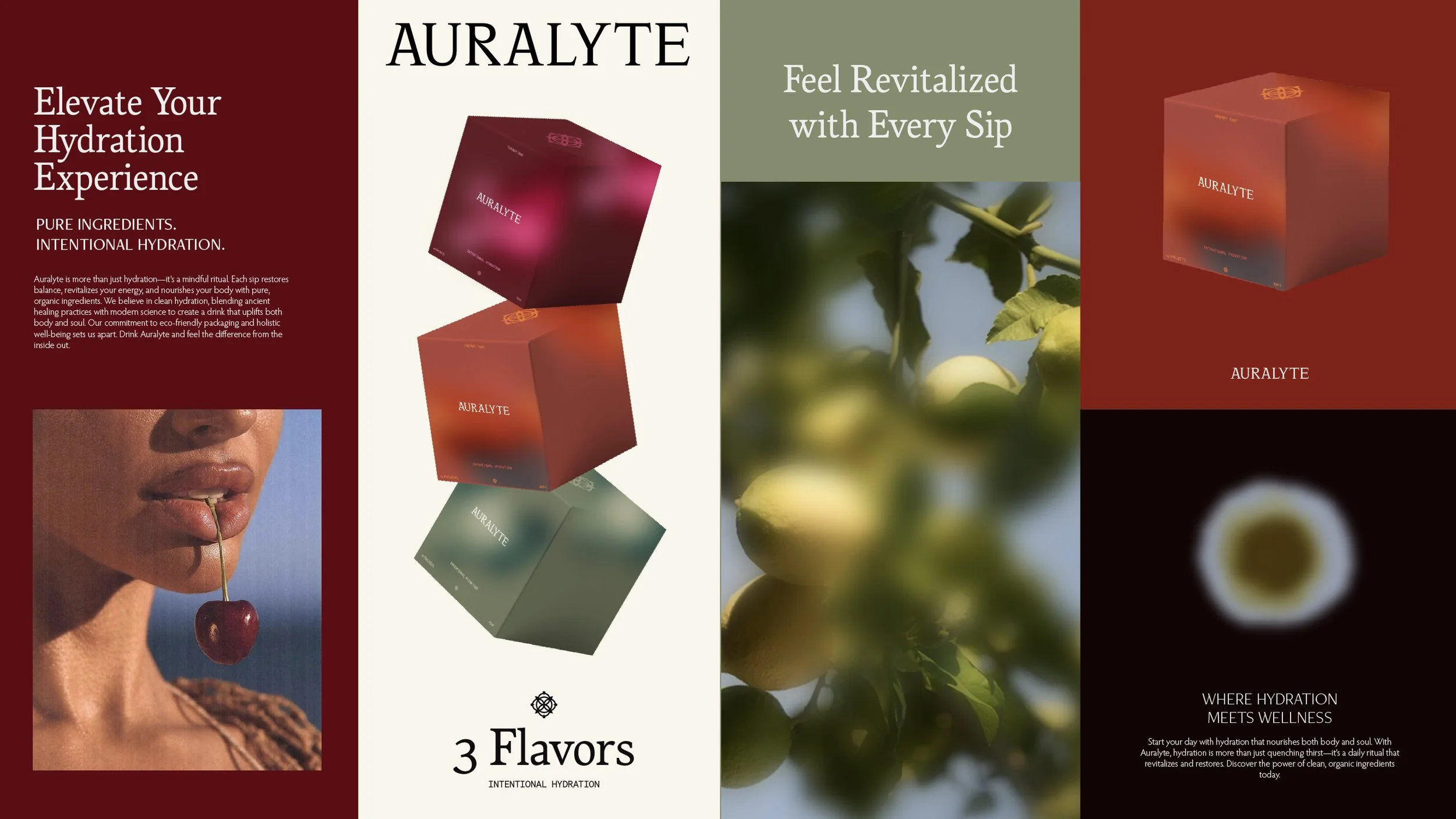
Auralyte is more than just a hydration product—it’s a lifestyle brand that blends clean, organic ingredients with an intentional approach to wellness. The project involved creating a cohesive visual identity, including branding and packaging. Through its rich branding and minimalist elegance, Auralyte positions itself as a premium yet relatable choice for consumers seeking high-quality hydration solutions.
The primary goal was to create a brand that stands out on crowded shelves while maintaining unity across multiple product flavors. The design needed to feel simple, modern, and cohesive, with a unique twist that tied into the concept of auras.
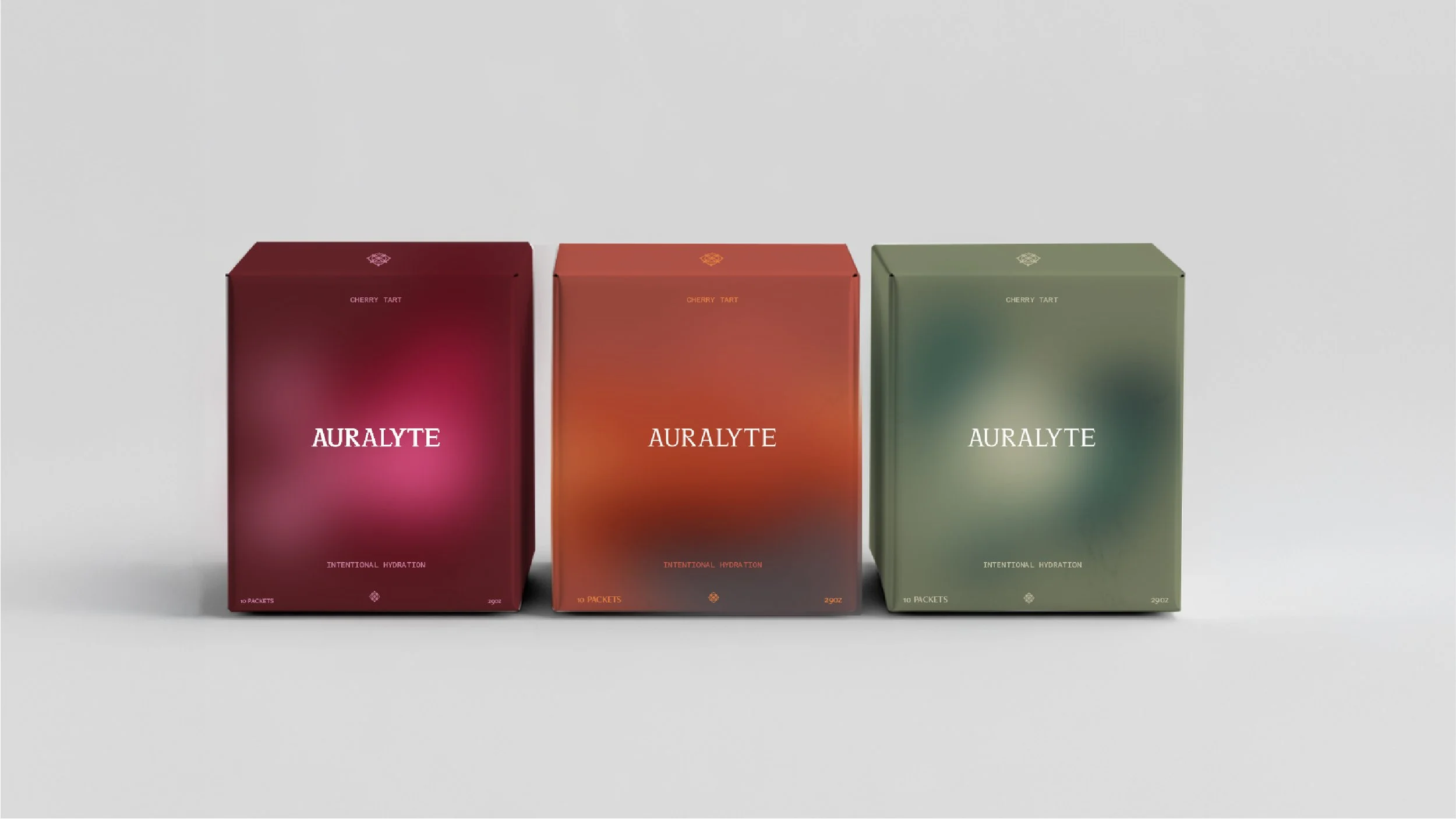
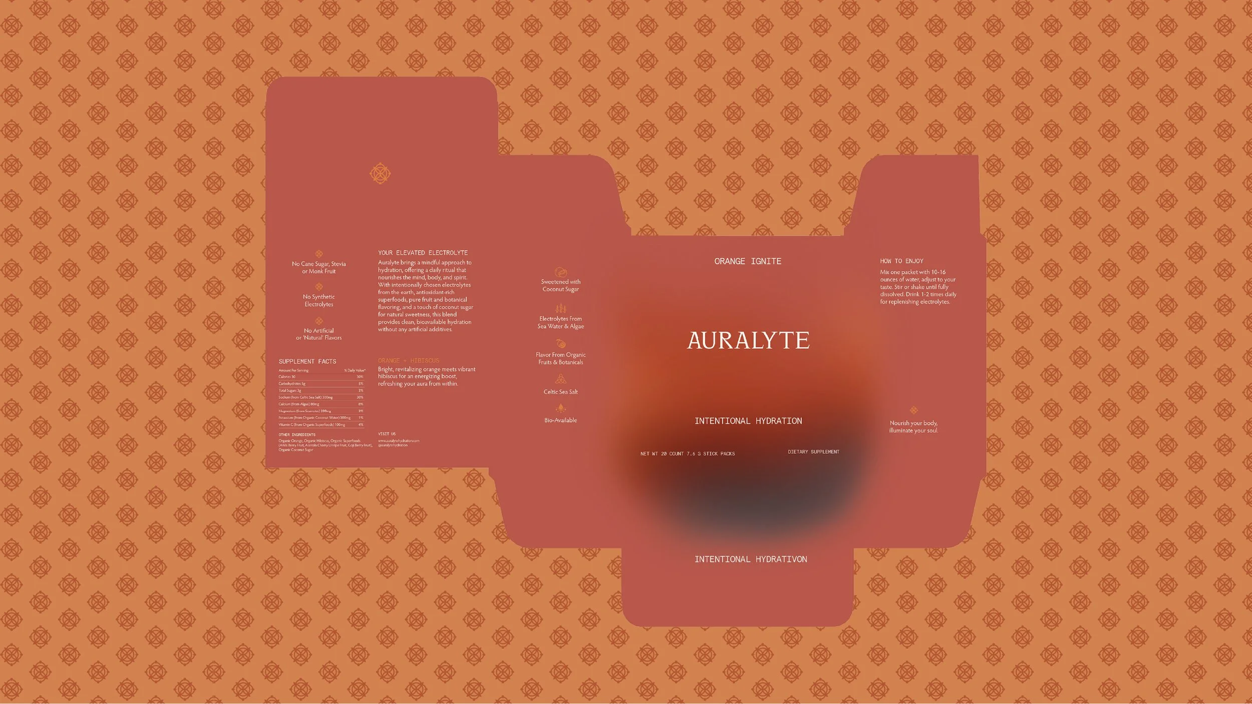
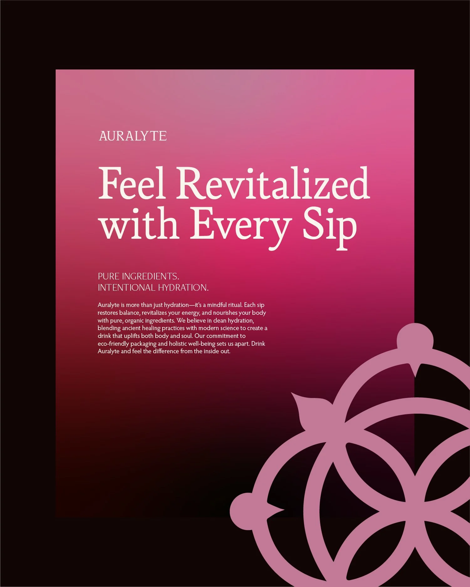
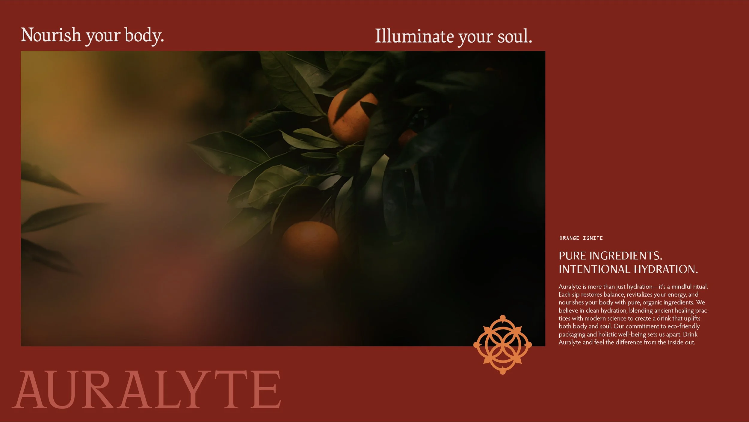
By emphasizing the concept of "Intentional Hydration," Auralyte’s visual identity incorporates clean serif typography, deep muted hues, and soft gradients that evoke a sense of natural balance.
The geometric water droplet icon reinforces harmony and purity Messaging such as "Feel Revitalized with Every Sip," elevates hydration into a purposeful ritual, connecting with customers on both functional and emotional levels.
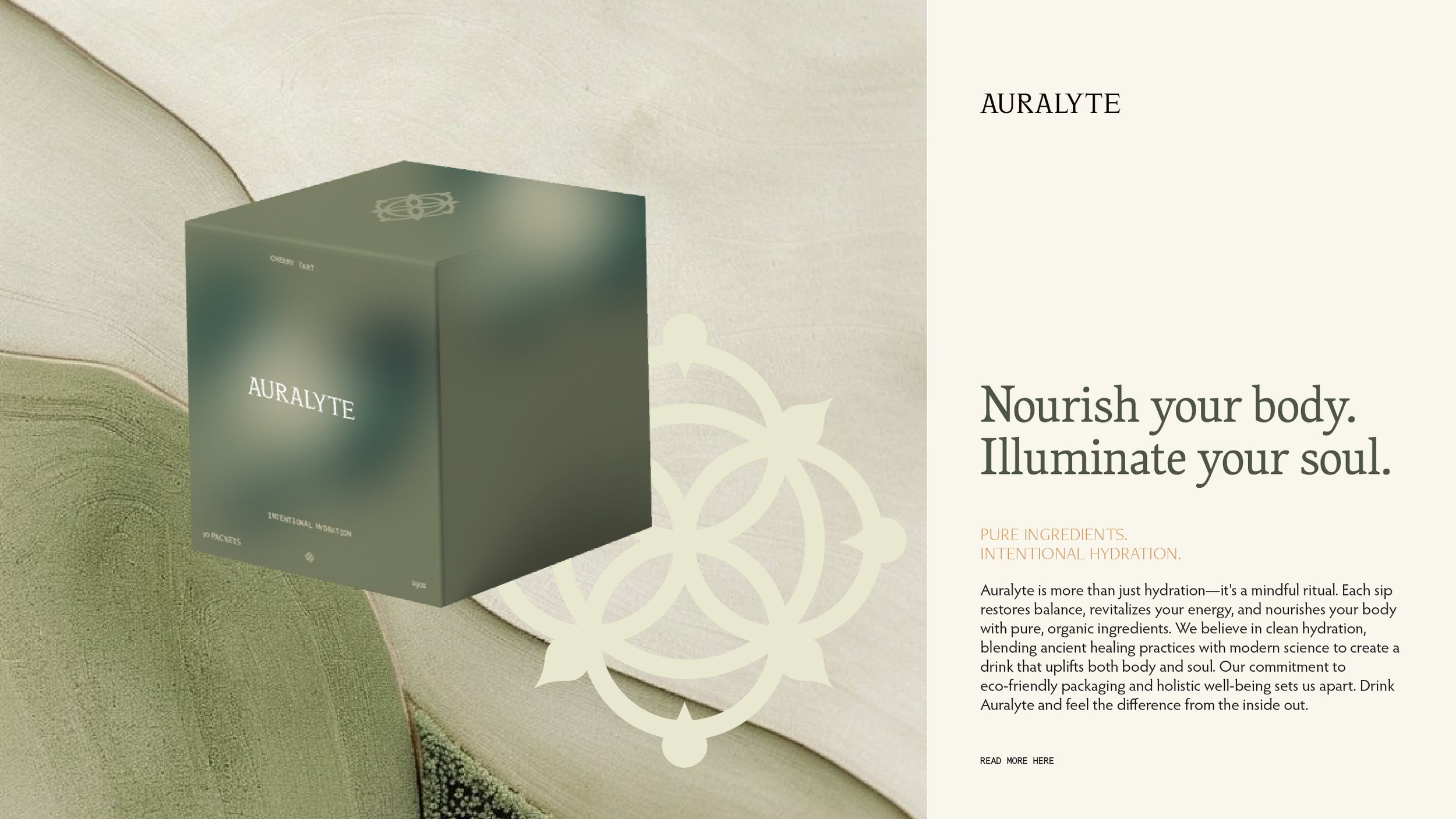
The Auralyte branding perfectly balances luxury yet approachability, appealing to discerning consumers who value mindfulness and sustainability. The design elements create a brand that feels as nourishing as the product itself, making it a standout in the wellness industry.
✣