
I LIKE IT RAW
2023 / CREATIVE DIRECTION
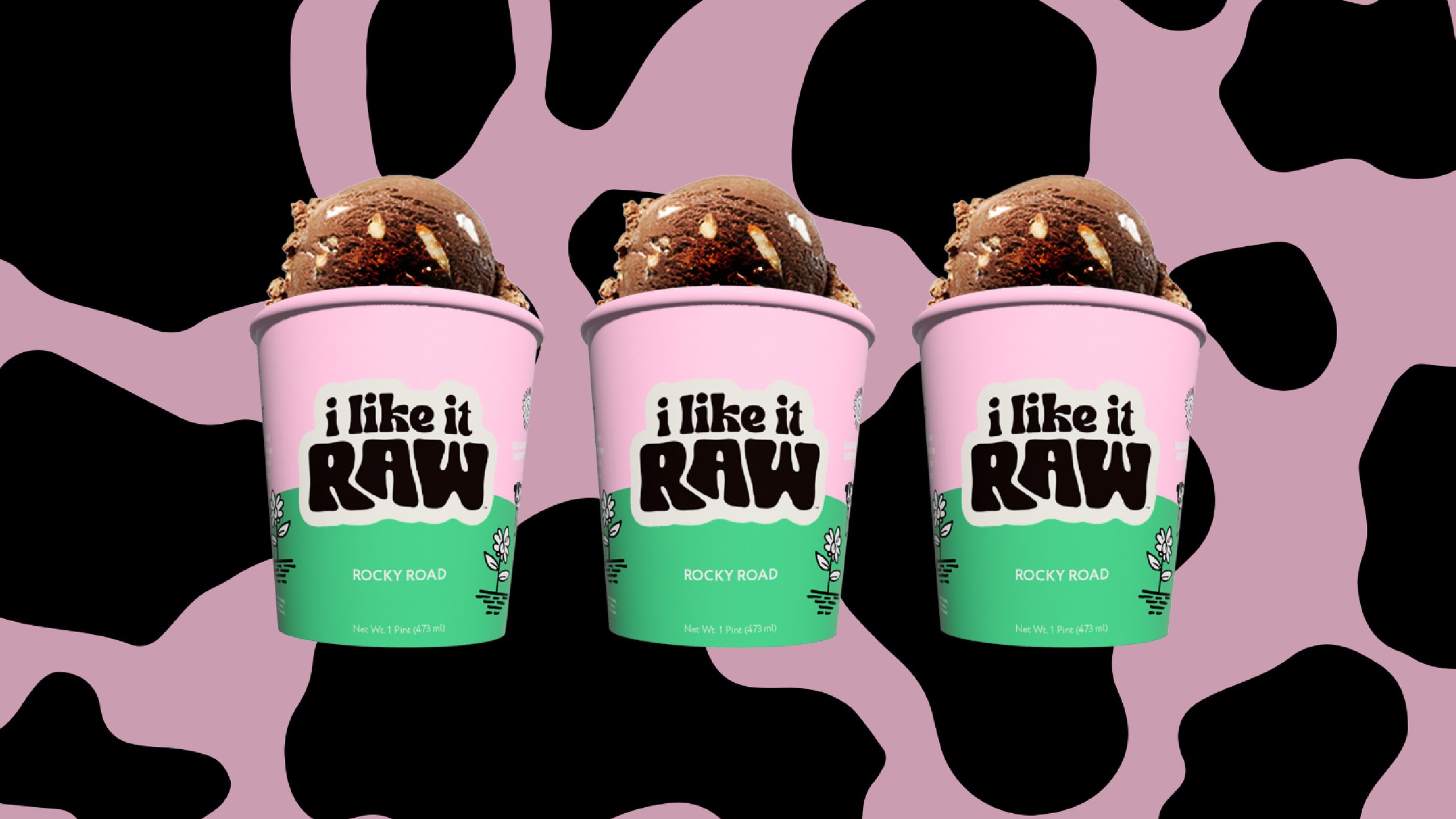
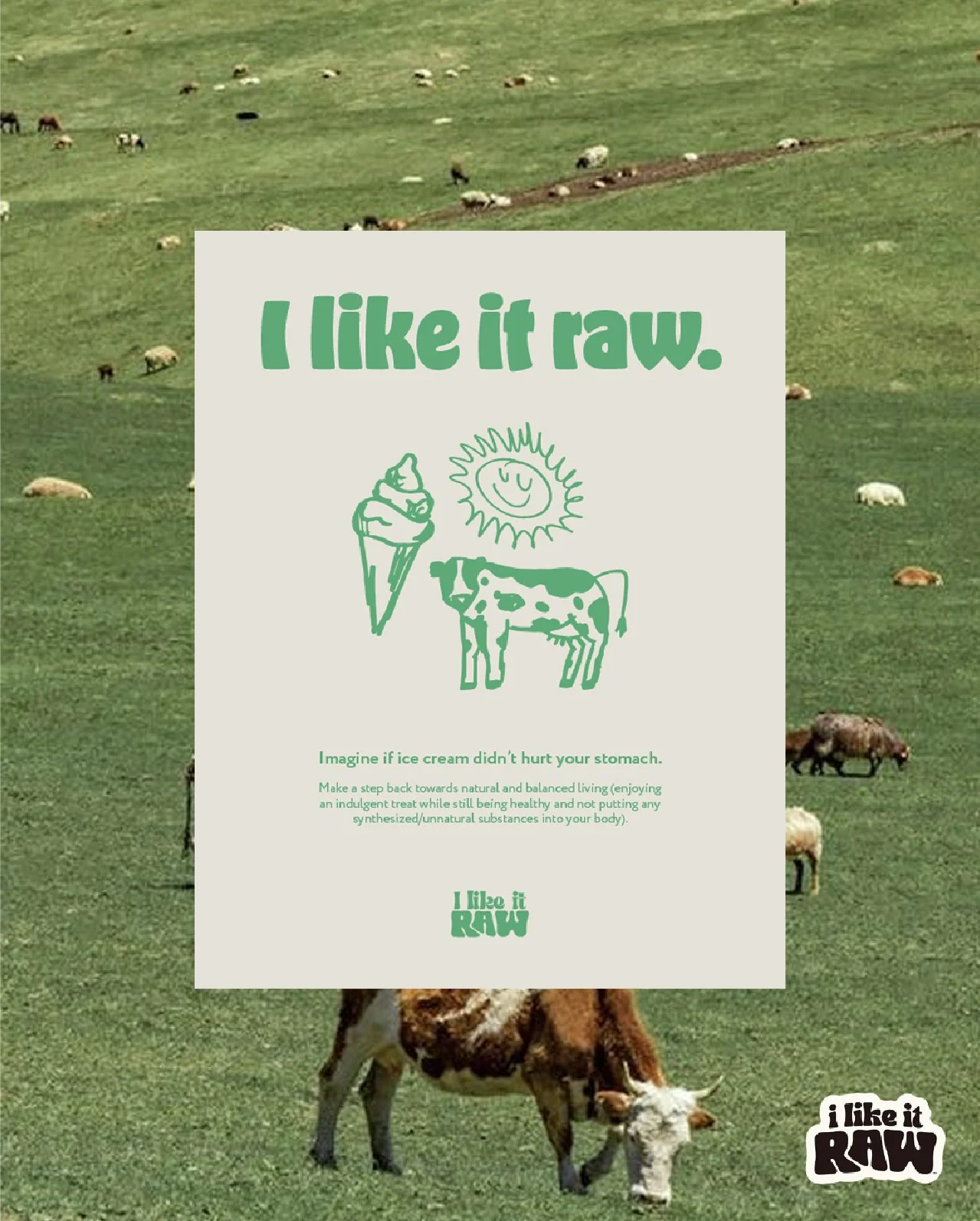
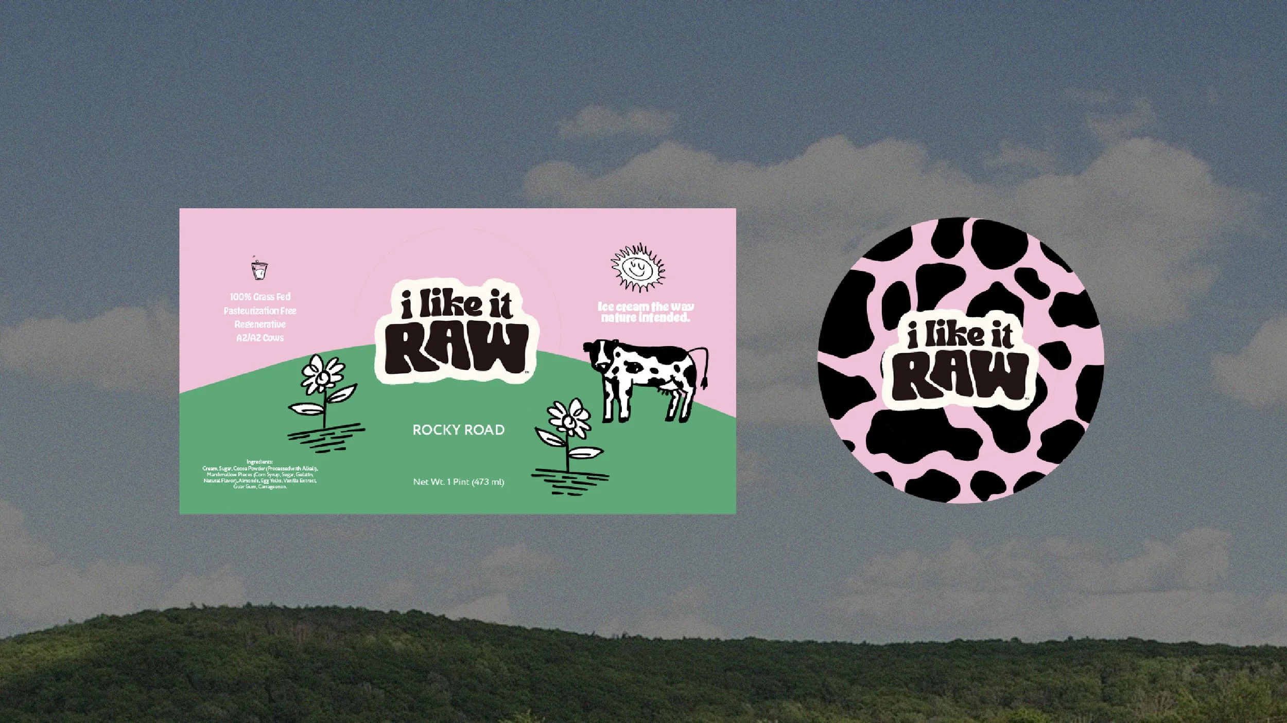
I Like It Raw, a bold new raw ice cream brand, needed a strong visual identity that would establish its unique look and feel while effectively launching into a competitive market. The project involved designing a logo, creating a distinctive color palette, crafting custom iconography, and developing standout packaging—all aimed at communicating a fun yet purposeful tone that merges health, authenticity, and playfulness.
As a brand-new company, it was essential to create an identity that was simultaneously provocative, playful, and authentic, striking a balance between edgy and wholesome to resonate with its eco-conscious, health-driven audience and stand out on the crowded ice cream shelf.
A Bold, Playful, and Authentic Identity
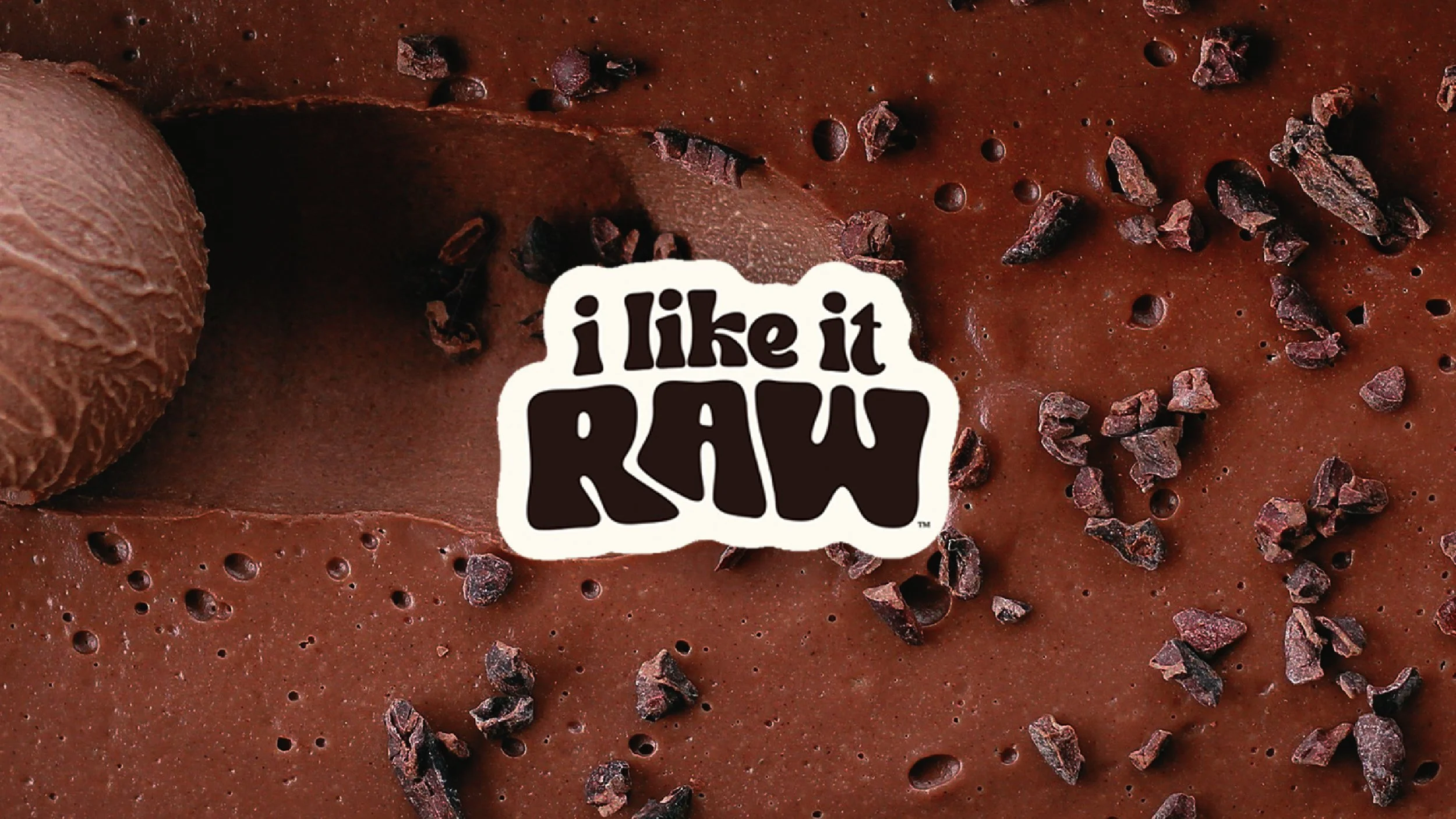
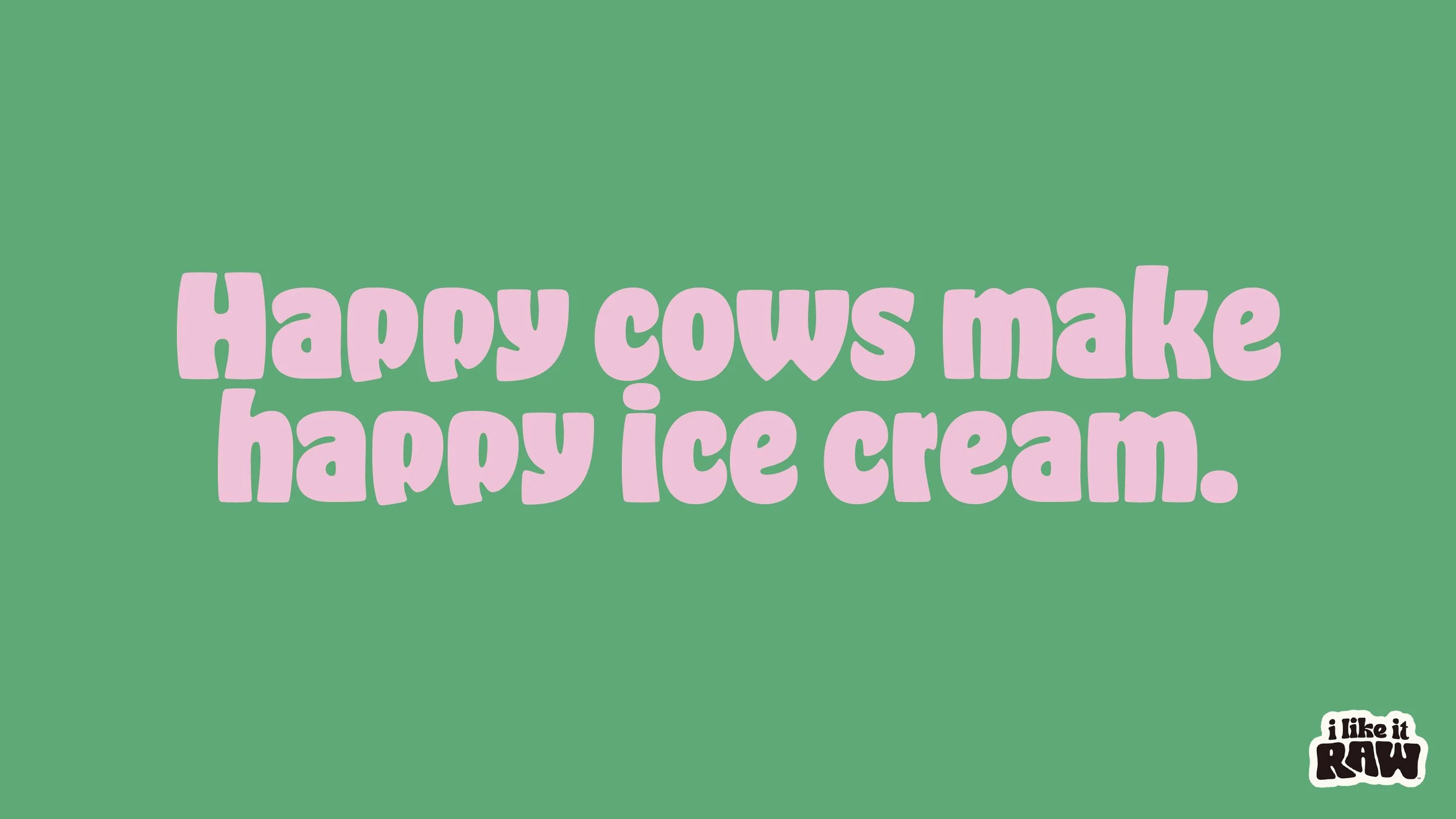
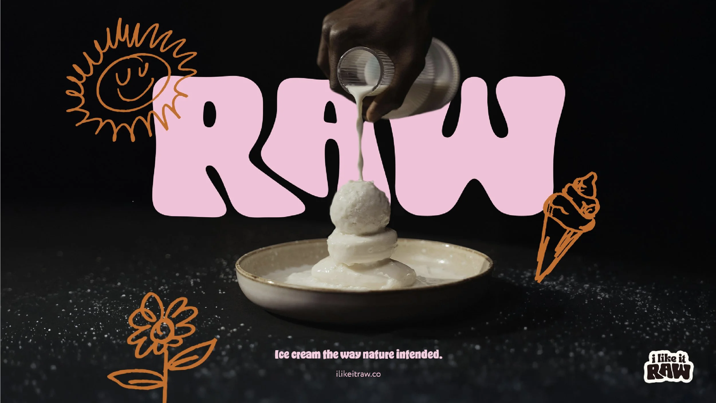
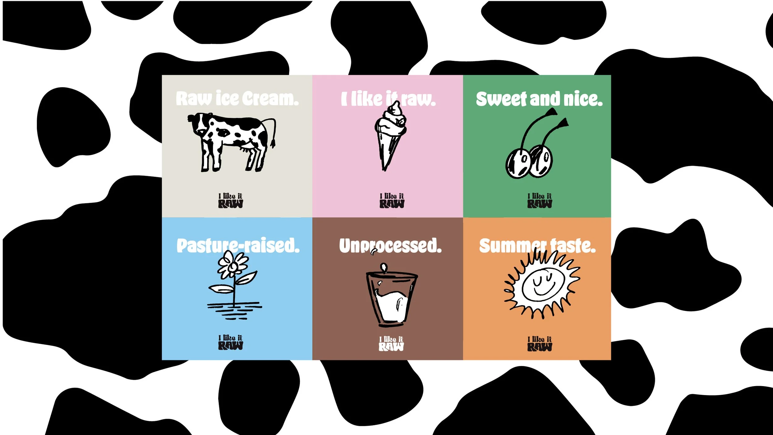
By incorporating bold typography, vibrant earthy tones, and hand-drawn illustrations, I Like It Raw’s brand identity communicates its raw and natural ethos in a fun, approachable way. The use of cow-print patterns connects back to the product’s raw milk foundation, while playful elements like the phrase “I Like It Raw” add a cheeky, memorable twist that grabs attention and builds emotional connection.
This project stands out because of its ability to balance edgy fun with authenticity. By combining cheeky, bold branding with artisanal visuals, "I Like It Raw" resonates deeply with health-conscious consumers seeking indulgence without compromise.
This project was particularly memorable because of the creative freedom and the joy of bringing a brand with so much personality to life. The result? A modern food brand that truly stands out in the marketplace.
✣